+44 1752 633 412 forinfo@pml-applications.co.uk
"The portal is amongst the most capable, attractive and professional web interfaces for viewing climate data from space"
The volume of project data is often vast, and identifying and presenting or sharing the relevant data in a way that means something to stakeholders, can be difficult. Plymouth Marine Laboratory’s webGIS portal is designed to be as easy-to-use as possible, is affordable and does not require any software installation, thereby giving access to non-specialist users.
The portal is already proving a very effective tool with several EU-funded projects, as well as with commercial industry clients and can include any geospatial research output from any scientific domain e.g. disease vectors, forest health, remotely sensed data, model outputs or in situ measurements. Examples and references are available.
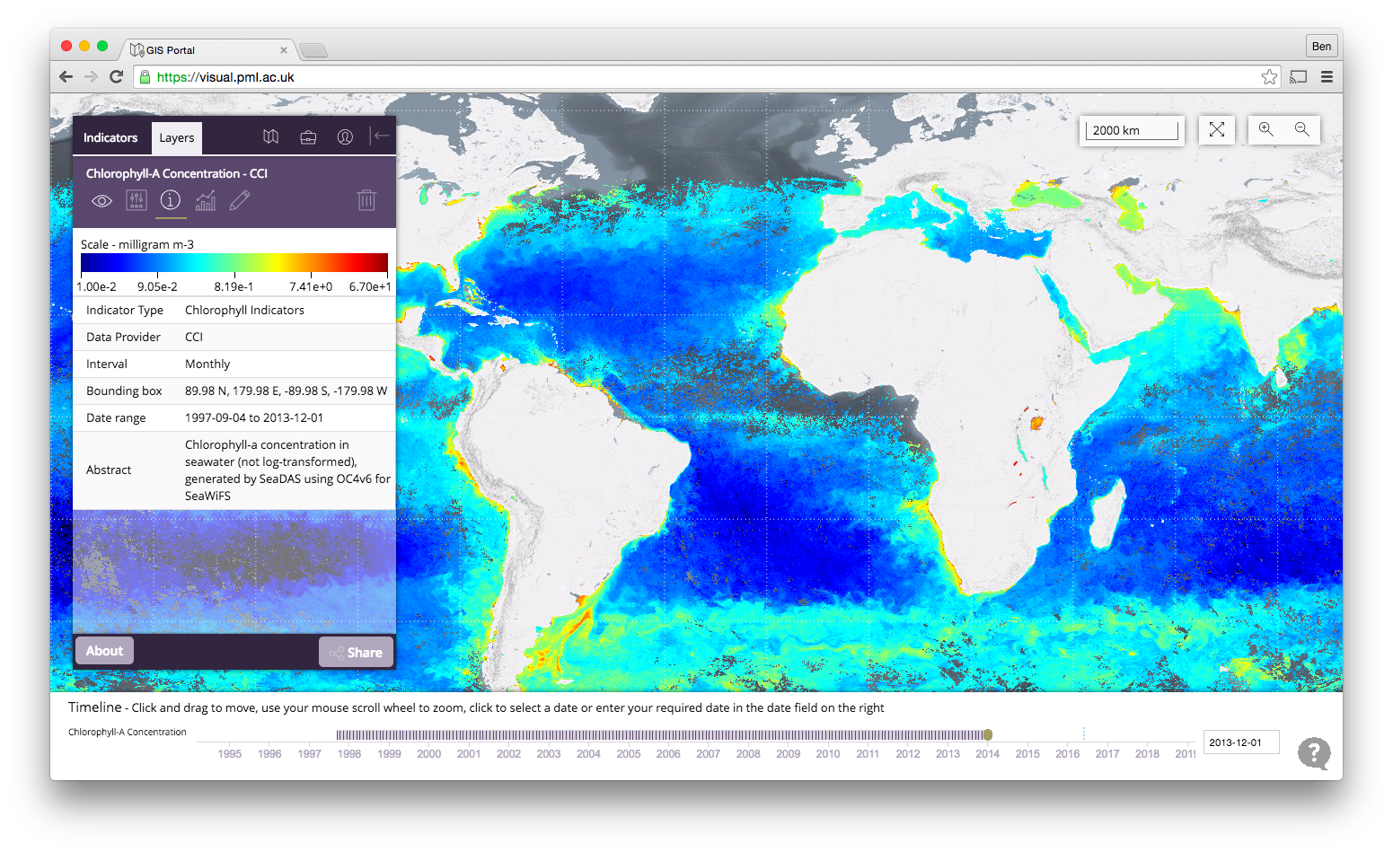
Ocean colour is one of 15 essential climate variables that ESA's Climate Change Initiative investigated. The data gathered from multiple satellite missions since 1997 is presented using the web based visualisation tool
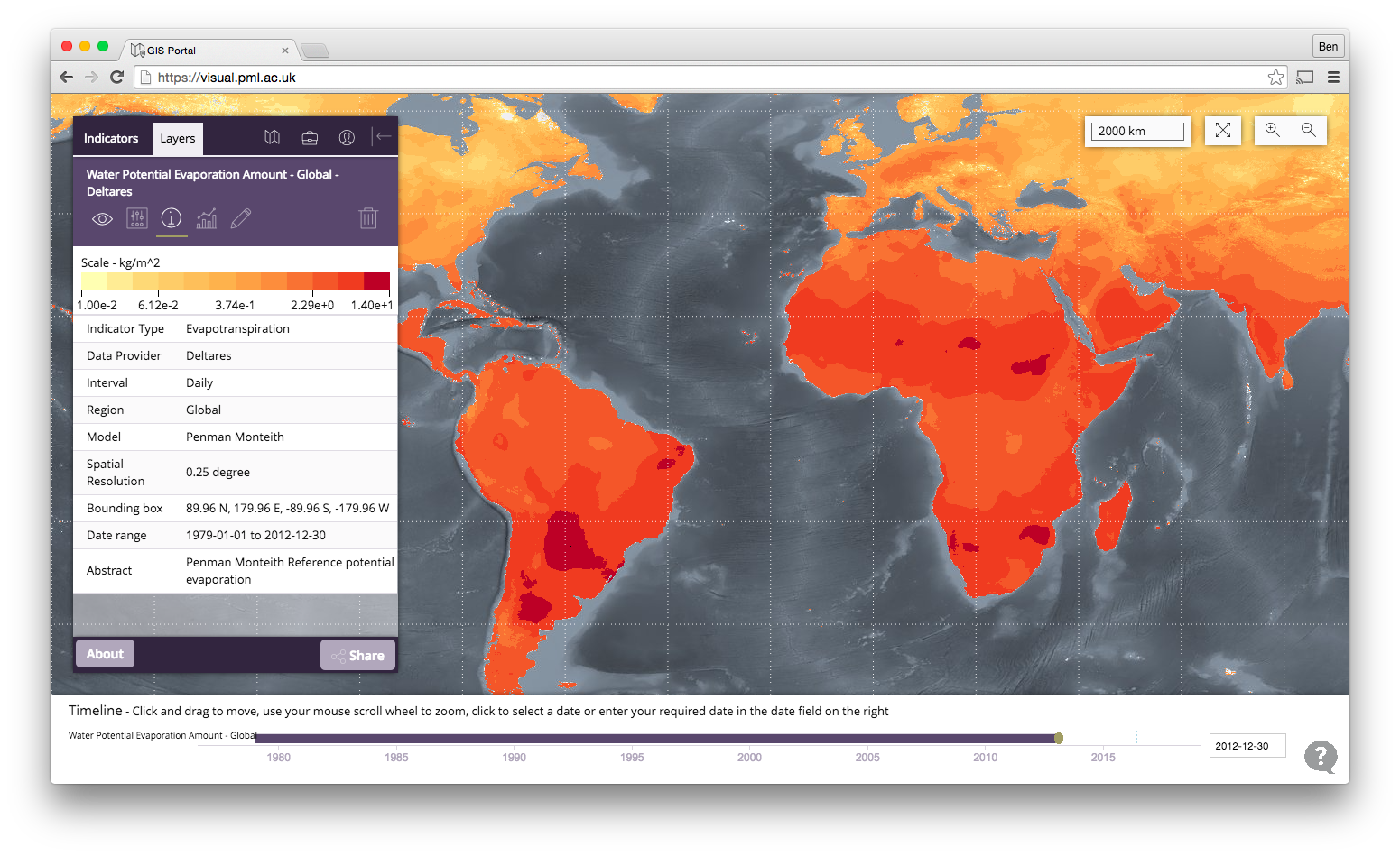
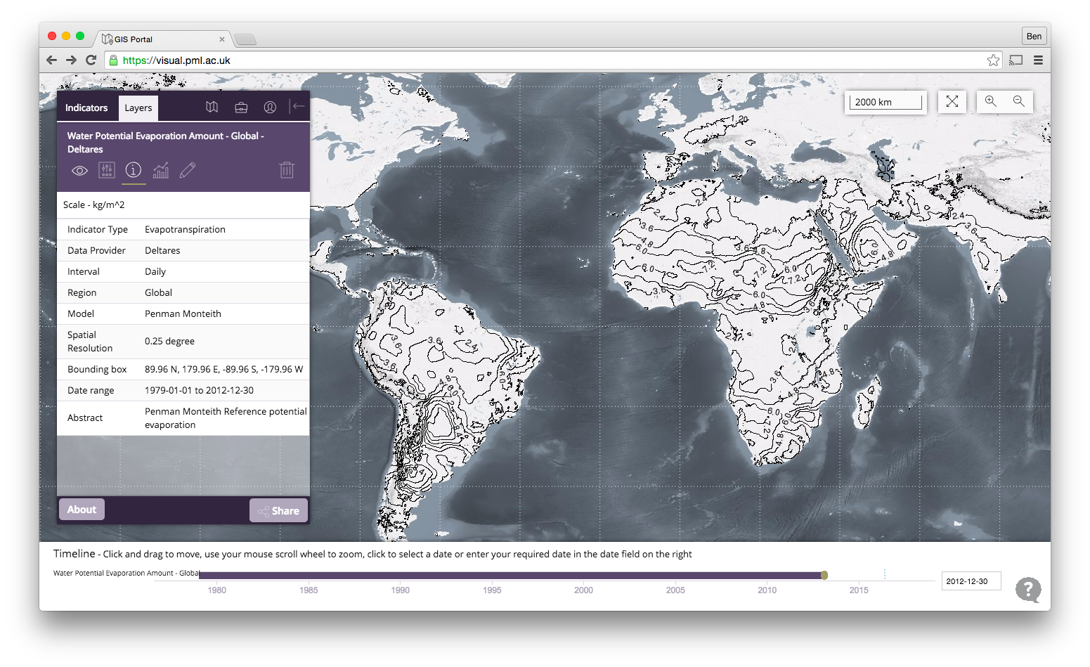
The eartH2Observe project is a €11M EU funded project that aims to contribute to the assessment of global water resources through the use of new Earth Observation datasets and techniques, and to construct a consistent global water resources reanalysis dataset of at least 30 years.
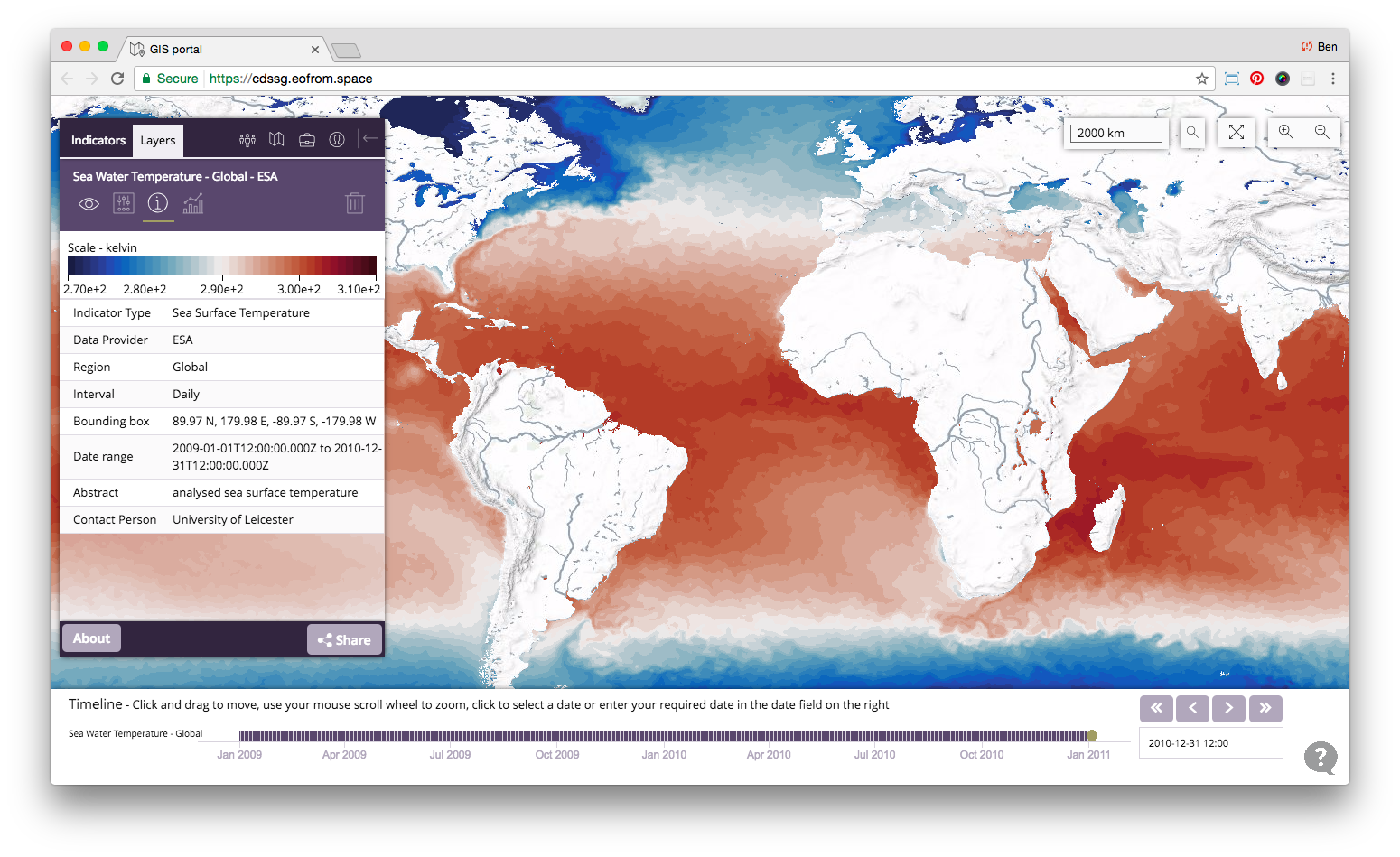
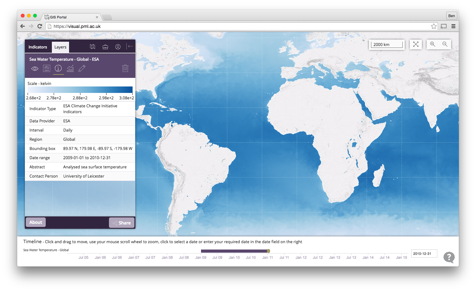
This example demonstrates a two year subset of sea surface temperature data provided by the University of Reading.
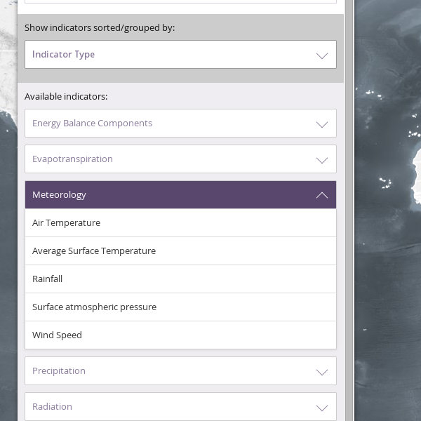
Indicators are initially displayed grouped by type; expand the drop down list to view the available indicators, click on one to show it on the map. You can change the way that indicators are grouped for a different view.
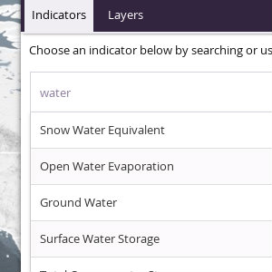
If you know the name of the indicator you are looking for simply start typing in the search box and matches will be displayed; click on a search result to show it on the map.
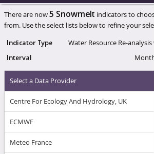
When the indicator that you have selected is available in more than one variant you will be presented with a number of choices to refine your selection and identify the exact variant to show on the map.
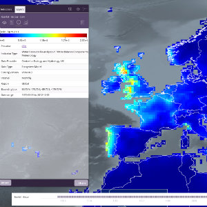
Once selected, an indicator will be displayed as the top layer on the map, with the most recent time slice visible. Click and drag to move the map around, use the zoom buttons find the area you are interested in, and use the timeline to move around in time.
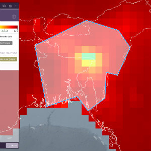
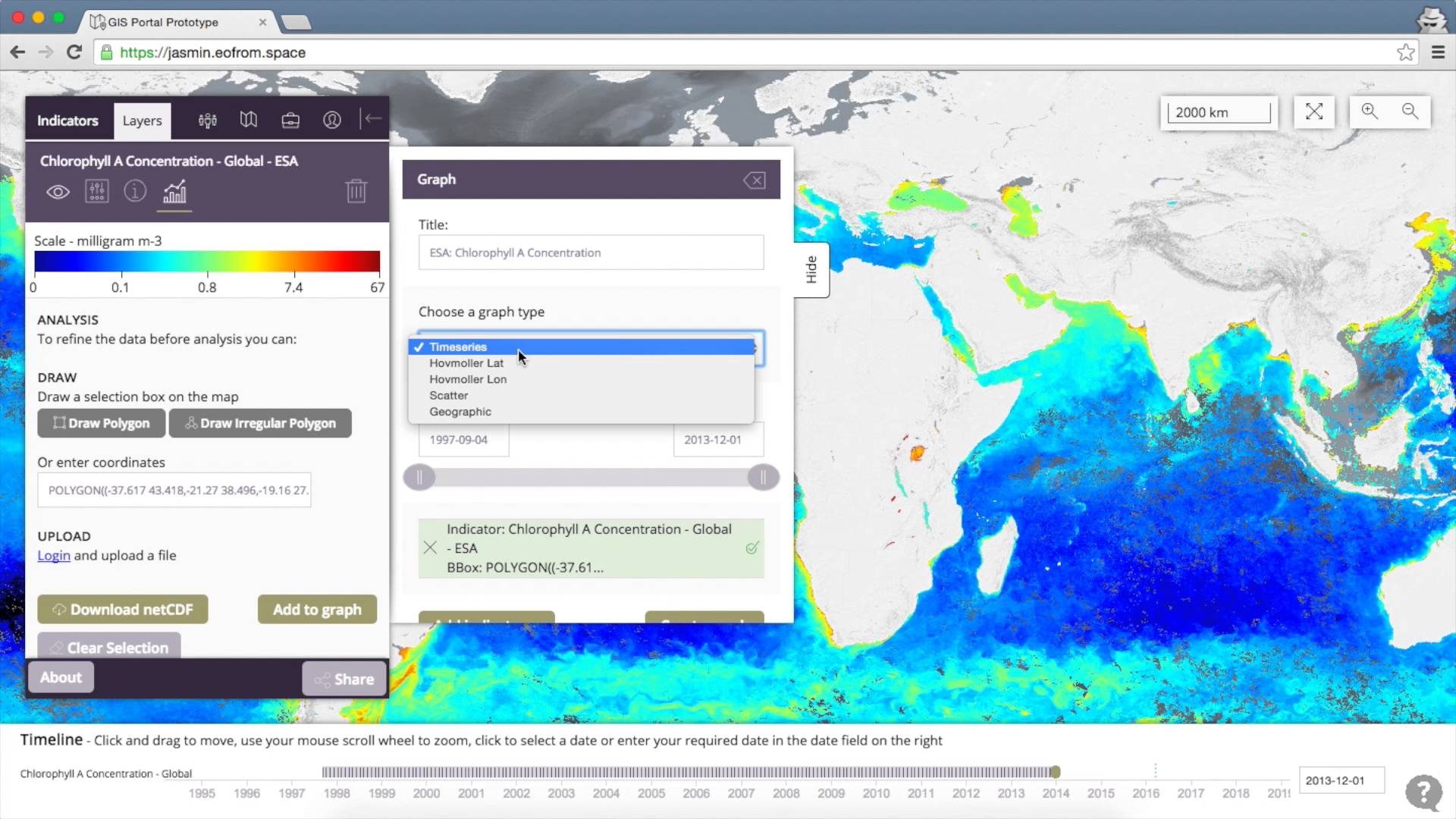
On the Layer Analysis tab click either 'Draw Polygon' to create a rectangular bounding box, or click 'Draw Irregular Polgyon' to create a multisided bounding box that closely matches the area of interest.
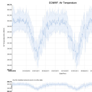
Optionally define a bounding box, select the type of graph to create (currently timeseries or Hövmoller), then specifiy the temporal range that the graph should display, and click 'Create Graph' to view the plot. Try adding multiple bounding boxes, or multiple indicators, to compare areas and/or indicators
This 20 minute video will give you an introduction on how to use the portal and the features that are available